4903
Analyzing CBF Connectivity Differences Affected by Hypertension in Arterial Spin Labelled Data Using Graph Theory1Department of Physics, University of Georgia, Athens, GA, United States, 2Georgia Prevention Institute, Augusta University, Augusta, GA, United States, 3Department of Psychology, University of Georgia, Athens, GA, United States, 4Department of Radiology and Imaging, Augusta University, Augusta, GA, United States
Synopsis
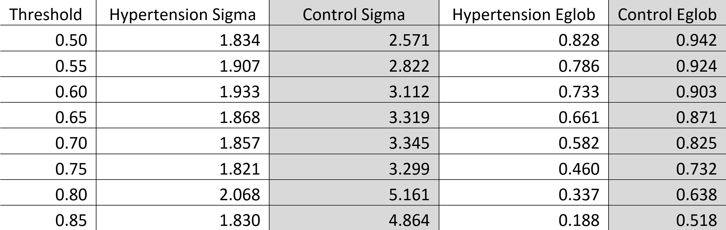
In a cross-sectional study of hypertension and its effects on brain connectivity, graph theory can be used to show cerebral blood flow connectivity differences between normotensive (n=32) and hypertensive (n=37) subjects. We obtain adjacency matrices from processed arterial spin labelling scans which can be used to determine several quantifications based on graph theory analysis. We find that normotensive subjects exhibit higher small-worldness and global efficiency (σ = 3.30 and Eglob = 0.73) compared to hypertensive subjects (σ = 1.82 and Eglob = 0.46). This trend continues for nearly all thresholding values and implies a measurable perfusion difference between the groups.
Introduction
Hypertension is a disease characterized by chronic high blood pressure and it affects an estimated 1.28 billion people world-wide.1 In this cross-sectional study, we study the effects of hypertension in a human cohort. We obtain arterial spin labelling (ASL) from each subject and apply a graph theory approach to processing the two groups’ data. While the use of graph theory in the analysis of brain connectivity is not a new idea2, we aim to quantify changes that may occur in cerebral blood flow (CBF) connectivity due to hypertension by comparing these results to normotensive subjects.Methods
Using a Siemens MAGNETOM Vida with a BioMatrix Head/Neck 20 receive coil, ASL and proton density data were acquired from 69 subjects (32 normotensive, 37 hypertensive) aged 40 ± 2.7 years via a 3D-ASL (TR=6000ms, TE=19.80ms, FA=90°, voxel size of 1.9x1.9x4.0mm3, matrix size of 128x128x40, slab thickness of 10mm, total acquisition time of 6:07 minutes), and a proton density sequence (TR = 6000ms, TE=21.00ms, FA=150°, voxel size of 1.9x1.9x4.0mm3, matrix size of 128x128x40, total acquisition time of 1:08 minutes).All subjects’ data were converted to a NIfTI file by MRIcron (v1.0.20190902)3. Each subject’s ASL data were preprocessed by Statistical Parametric Mapping 12 (SPM12)4 toolbox to reorient the images and spatially normalize to the 152-image Montreal Neurological Institute space (MNI152, image dimensions of 193x229x193 and a voxel size of 1x1x1 mm3). A scan-to-scan normalization factor was calculated and used as a subject-specific multiplier in the calculation of individual CBF to account for scan-to-scan variance. CBF was calculated via the modeling equation found in the literature.5 The CBF maps were parcellated into 96 regions (excluding ventricles) via the MNI152 atlas and the mean regional CBF values were calculated. Pearson correlation analysis of the parcellated brain regions resulted in a heatmap that was thresholded to find adjacency matrices. These resulting adjacency matrices were processed using MATLAB 2019b to obtain their small world attribute (σ) and global efficiency (Eglob).
Small world attribute is calculated by the following:6
$$ \sigma = \frac{\gamma}{\lambda} \quad ; \quad \gamma = \frac{C_p}{C_{p\_rand}} \quad , \quad \lambda = \frac{L_p}{L_{p\_rand}}$$
Where $$$C_p$$$ is the mean clustering coefficient of the graph, $$$C_{p\_rand}$$$ is the mean clustering coefficient from a corresponding randomly connected graph, $$$L_p$$$ is the characteristic path length of the graph, and $$$L_{p\_rand}$$$ is the characteristic path length of a corresponding randomly connected graph. This $$$\sigma$$$ is a description of the graph and how it is organized. A system is considered a small world when $$$\lambda \approx 1$$$, $$$\gamma > 1$$$, and $$$\sigma > 1$$$.
The global efficiency $$$E_{glob}$$$ of a graph $$$G$$$ can be calculated by the following:6
$$ E_{glob} = \frac{1}{N(N-1)}\sum_{i \neq j \in G}\frac{1}{d_{ij}} $$
Where $$$d_{ij}$$$ is the shortest path length between the nodes $$$i$$$ and $$$j$$$ and $$$N$$$ is the number of nodes in the graph. The $$$E_{glob}$$$ quantity is a measure of how easily information can be transmitted from one node to another.
Results
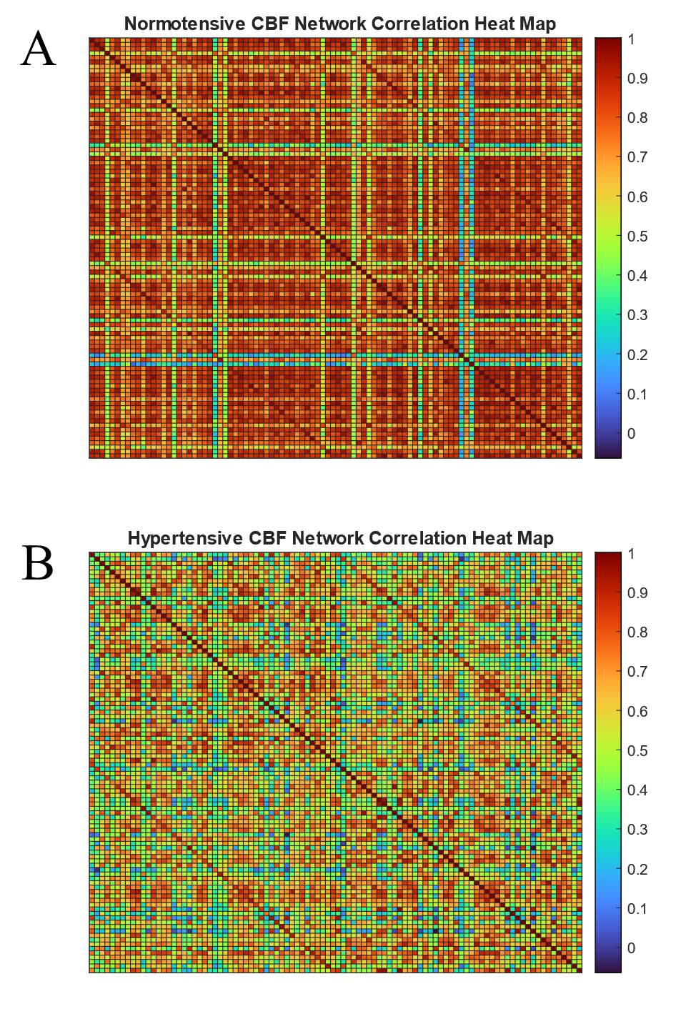
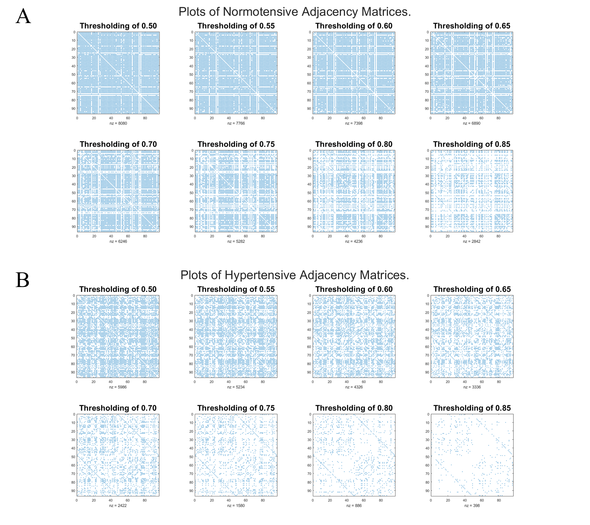
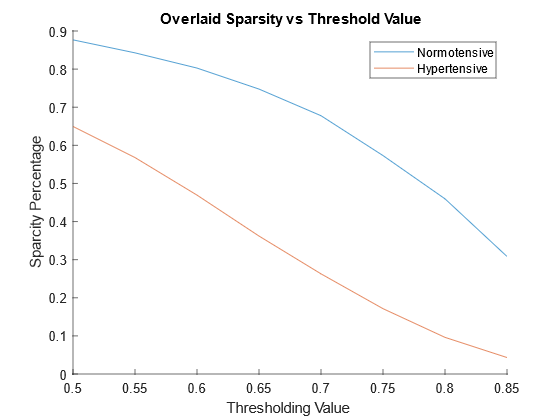
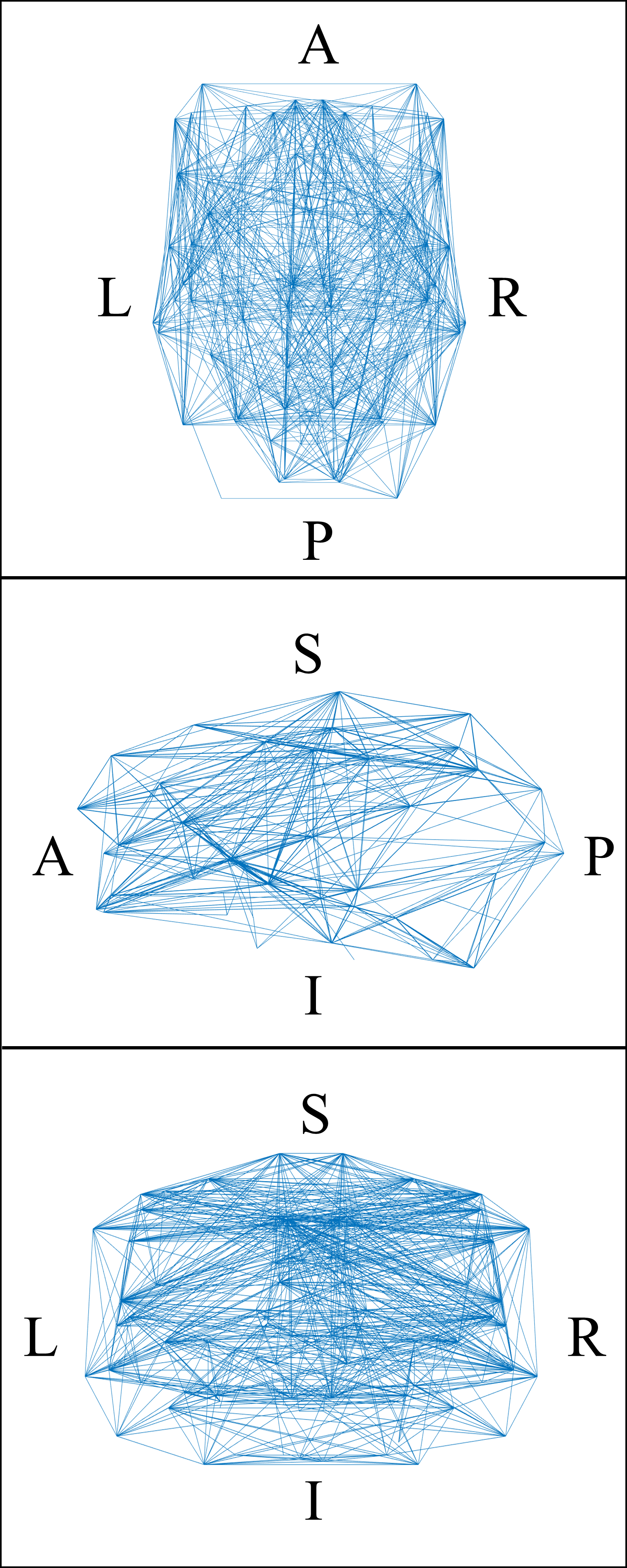
The Pearson correlation matrix of the normotensive group is presented as a heatmap in figure 1A. The same matrix for the hypertensive group is shown in figure 1B. The normotensive group exhibits an overall higher trend in r values when compared to the hypertensive group which is exemplified by their median values of 0.79 for the normotensive subjects and 0.59 for the hypertensive individuals. After these maps are thresholded, their occupation fraction was measured. The occupation fraction is obtained by dividing the number of non-zero entries of the adjacency matrices by the total number of entries of those same matrices. A sparsity plot is then obtained from these occupation fractions (figure 3). From this sparsity plot, the relationship seen in the heat map is further described by the trend observed in the lines. A representative plot of the CBF connectivity for a given thresholding (0.75) is seen in figure 4. A summary of quantifications can be found in table 1 below.Discussion and Conclusion
In this study, we quantified differences between the hypertensive group and normotensive group by two graph theory attributes. Through these two quantifications, we see that the normotensive subjects show a higher global efficiency as well as a higher small-worldness attribute. While we are unsure about the physiological meaning behind these quantifications, we are currently working to understand this link.Acknowledgements
This work is funded by NIH grant R01HL143440 and the Augusta University MRI Intramural Program.References
1. World Health Organization. Hypertension, 2021. Geneva, Switzerland: World Health Organization; https://www.who.int/news-room/fact-sheets/detail/hypertension. Accessed October 18, 2021.
2. Melie-García, L., G. Sanabria-Diaz, and C. Sánchez-Catasús, Studying the topological organization of the cerebral blood flow fluctuations in resting state. Neuroimage, 2013. 64: p. 173-84.
3. Rorden, C., H.O. Karnath, and L. Bonilha, Improving lesion-symptom mapping. J Cogn Neurosci, 2007. 19(7): p. 1081-8.
4. Penny, W.D., et al., Statistical parametric mapping: the analysis of functional brain images. 2011: Elsevier.
5. Alsop, D.C., et al., Recommended implementation of arterial spin-labeled perfusion MRI for clinical applications: A consensus of the ISMRM perfusion study group and the European consortium for ASL in dementia. Magn Reson Med, 2015. 73(1): p. 102-16.
6. Wang, J., X. Zuo, and Y. He, Graph-based network analysis of resting-state functional MRI. Frontiers in Systems Neuroscience, 2010. 4(16).
Figures