3168
Data Selection for Deep Learning via diversity visualization and scoring1Advanced Technology Group, GE Healthcare, Bangalore, India
Synopsis
Data diversity is a key ingredient for robust deep learning models, especially in the medical domain. We present a diversity visualization and quantification scheme which enables decisions on data selection different enough from already existing data. Out experiments amply validate the usefulness of the proposed diversity metric in terms of enhancement in accuracy of models resulting from using them in data selection decision process with accuracy improvement from 3%->10% across different sites.
Introduction
With AI based algorithms in vogue, making a judicious choice of data for a given AI task is very important. Adding new data similar to existing train data distribution could result in over-fitting, hamper generalizability, and affect robustness. In addition, monetary and logistics constraints could also influence choice of data to be generated or acquired. In this work, we describe a methodology for visualizing and quantifying the data diversity. We also demonstrate how this tool guides data selection and thereby impacts performance of MR knee label classification.Methods
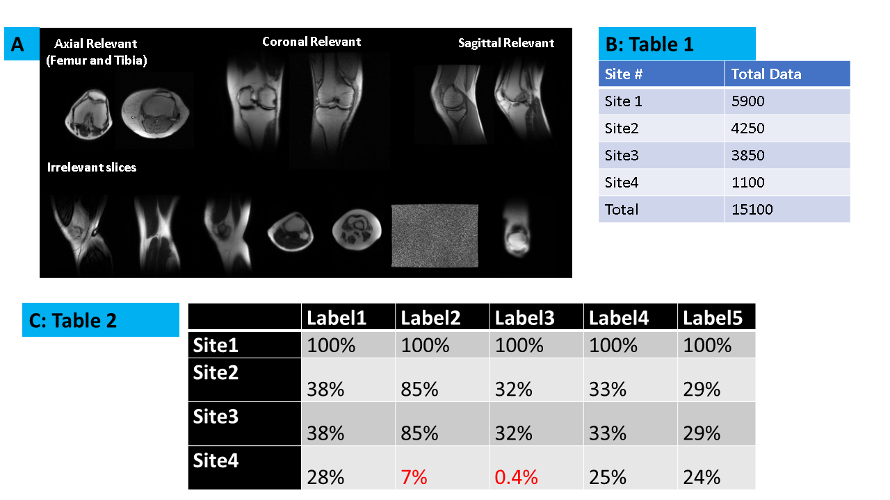
Subject Data: Knee MRI data for study came from four sites (Sites 1-4, Fig 1). Data from volunteers as well as patients were included in the study. Data from each site was segregated into train (60%), validation (20%), and test (20%) cohorts. All studies were approved by respective IRBs.MRI Scanner and Acquisition: Localizer data was acquired on multiple GE 1.5T and 3T MRI scanners, with different knee coil configurations, contrast (GRE, SSFSE), image resolution and matrix size across subjects. A total of 15100 localizer images were included in the study.
Deep Learning based classification model: A DL-CNN based classification model as described in [1] was used to label the given Knee MRI tri-planar localizer as belonging to one of the five different labels : Label 1: Relevant axial femur, Label 2: Relevant axial tibia, Label 3: Irrelevant, Label 4: Relevant Coronal and Label 5: Relevant Sagittal (Fig. 1A). Site 1 is considered as reference site on which a DL model M was initially trained.
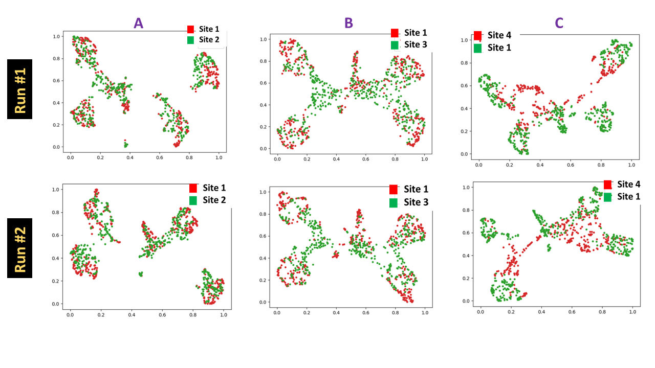
Feature Generation and Visualization: Given a pool of data, we derive latent representations as the features ( total = 16384) extracted from the penultimate layer of model M (Fig.2). The reference site features are used to construct a UMAP transform [2] to reduce features to smaller space (= 2) and normalized to lie between 0 and 1, per feature. For a given new site data , the DL features derived for that data from model M undergo a similar dimensionality reduction, but using existing UMAP transform. The 2D feature scatter plot showing the UMAP reduced features for reference and new site data allows for visualization of data diversity. This is different than regular tSNE [3] visualization since UMAP allows learning the mapping from higher dimensional to lower dimensional space on the train data and then applying the same transformation to any new test data, which is not possible with current implementation of tSNE.
Diversity quantification: For reference site, class labels are known. Consequently, for each label, UMAP feature cluster centroid and the mean distance from the cluster centroid (Dref) was obtained. Similarly, for new site data, mean distance of UMAP features of new site test data pool from nearest reference cluster centroids is computed (Dnew). The diversity score for a new site is then computed = Dnew / Dref.
Since this process is stochastic in nature, multiple runs were done ( two runs for visualization and three runs for diversity score). All the methods were implemented with functionality in Tensorflow 2.3, UMAP Learn package [4] and in Python 3.6.
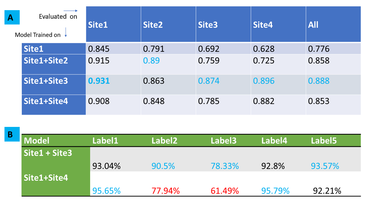
Impact of data diversity on DL task: Sites 2-4 are considered as new sites and decision was needed on which site(s) to be included in training cohort. We trained models using data from Site1 and in turn added from each new site ( 2 to 4) to Site1 cohort and generated new DL models. These models were then evaluated on test samples from individual sites as well as entire test data pooled among Sites 1-4 and performance assessed vis-à-vis data diversity.
Results and Discussion:
From Fig.3 and Fig 4, it is well appreciated that the proposed framework is a good indicator of data diversity. Site3 and Site4 have pronounced scattering and higher diversity scores. Site2 is clustered tightly around Site1, indicating that it is not much different from Site1 data. So based on this analysis, we suggest that Site4 and Site3 would be best candidates for inclusion in new training (in that order).Site3 data results in best classification accuracy in all site pooled test data (89%) as well for test data from Sites 1,3 and 4 (Fig.5A). Moreover, notice that Site3 based model boosts the accuracy for Site4 (most diverse) data compared to Site2 based model (Site3 model = 89%, Site2 model = 72%). While Site4 inclusion does improve overall accuracy (85%), the impact is not as profound as compared to Site3. This effect is primarily attributed to the skewed label data balance. From Fig 5B, it is evident that Site4 inclusion results in higher accuracy for the labels which have similar data balance in comparison, to Site2 or 3 (See Fig.1C). For labels 2 and 3, which are highly imbalanced in Site4 ( ~ 7% and 0.4%), the corresponding accuracy for Site4 based model are also lower (78% and 61%). This suggests that our hypothesis of using the data diversity visualization is reasonable for adding data from new sites, provided the datasets are also more -or less balanced out.
Conclusion
Overall, the experiments validate our intuition that proposed diversity framework is a sound basis for judicious data selection in deep learning-based model development.Acknowledgements
No acknowledgement found.References
1. Shanbhag DD et.al. A generalized deep learning framework for multi-landmark intelligent slice placement using standard tri-planar 2D localizers. In Proceedings of ISMRM 2019, Montreal, Canada, p. 670.
2. Leland McInnes, John Healy, James Melville, UMAP: Uniform Manifold Approximation and Projection for Dimension Reduction, arXiv:1802.03426., 2018 (https://arxiv.org/abs/1802.03426)
3. T-SNE – Maaten, L.V.D. and Hinton, G., 2008. J. of Mac. Learn. Res. 9, pp.2579-2605.
Figures