5215
Advances in structural and functional connectivity visualization using the Fibernavigator1CUBRIC, Cardiff University, Cardiff, United Kingdom, 2SCIL, Computer Science, University of Sherbrooke, Sherbrooke, QC, Canada
Synopsis
Scientific data visualization is constantly challenged by the continuously growing diffusion MRI (dMRI) field. Exploring and interacting with high-dimensional datasets is central to every analysis pipeline, allowing us to better understand the behavior of a certain tracking algorithm, for example. In this abstract, we present a brief overview of the recent advances in data analysis & visualization available inside the Fibernavigator package.
Introduction
With the advent of personalized medicine and the increasingly large amount of MRI data acquired per subject, image interpretation and visualization is nowadays constantly challenged by the high dimensionality of such datasets[1]. Moreover, efficient data visualization that permits meaningful inferences to be drawn from the data, is often underdeveloped in many structural and functional connectivity processing packages. As such, there is an unmet need for scientific visualization tools for quick and efficient exploration of multi-modal neuroimaging data. Here, we present a set of visualization features that have been recently integrated into the Fibernavigator software package. These features provide answers to existing visualization problems and are summarized in 3 categories below: i) interactive tractography; ii) functional connectivity on-the-fly; and iii) connectomics visualization.Real-time Tractography (RTT)
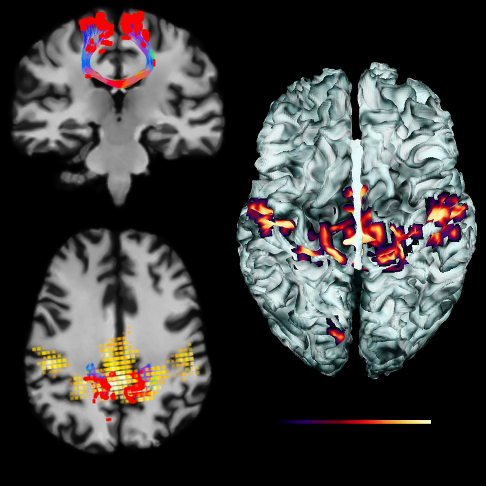
Instead of conventional “offline” tractography where the user is blind to the tracking process, the Fibernavigator offers a fully interactive tractography module that allows one to tune a series of parameters (e.g. step size, curvature, thresholds) and instantly see their effect on the streamlines reconstruction[2]. The framework requires a set of diffusion peaks, derived from any local reconstruction model (e.g. maxima extracted from fiber orientation distribution functions (fODFs)[3]) and a tractography mask (e.g. white matter (WM) mask). The user is then given access to a small sizeable seed-ROI filled with up to 8000 seeds. The ROI can then be interactively moved anywhere within the brain volume to generate different fiber bundles. If desired, a more general “whole-brain”seeding option is also available, (e.g. seeding from WM/gray matter (GM) interface) with N seeds per voxel (e.g. N > 2M seeds, ~30s). The value of real-time tractography is that the user never has to request streamlines to be updated (waiting for offline reconstructions); meaning that every time a parameter change is detected, streamlines are automatically recomputed and rendered live. Resulting streamlines can then be sliced[4] or virtually segmented (Fig. 1). In addition, since streamlines are rendered on-the-fly, mapping the peak amplitude along them is undemanding (Fig. 2). Traditionally, one had to find the inverse mapping between pre-computed streamlines and their associated peaks at each voxel. A complimentary and particularly useful streamline rendering technique proposed by Tax et al.[5] is also part of the Fibernavigator. In short, the method allows users to selectively extract pathways of the brain based on orientation-dependent transparency rendering. The RTT tool also found application in visualization of Meyer’s loop, a key WM pathway of the visual system (Fig. 3), and which must be spared as much as possible during neurosurgery. The technique relies on a new ROI-mechanism (MAGNET)[6] that supplies directional information in real-time during the tractography process, allowing to reconstruct a significantly greater anterior extent of Meyer’s loop compared to conventional reconstructions.Functional connectivity on-the-fly
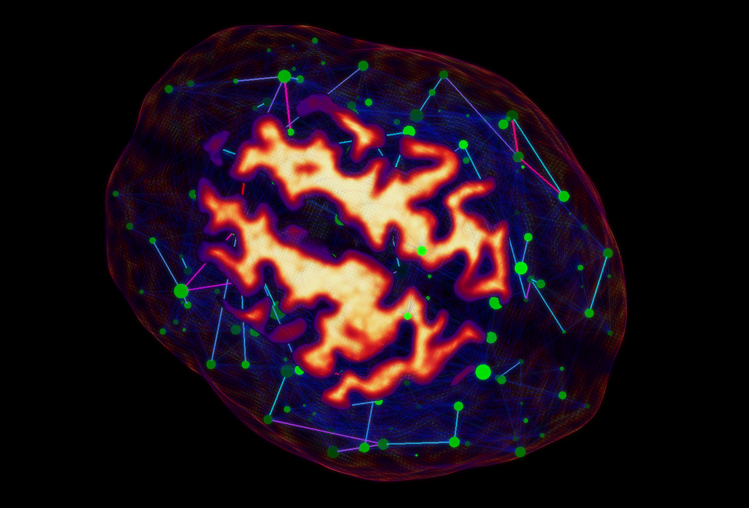
Functional connectivity maps can be generated using the same ROI principle as described previously. In this case, the average BOLD signal is first extracted from within the ROI and correlated with all remaining voxels. Whenever the ROI is moved in the 3D space, a new network is instantaneously derived and rendered using small light particles. Each particle has its specific opacity and size, scaled according to its Z-score. Note that the method can be easily combined with the aforementioned interactive tractography to either generate fMRI-driven tractography (e.g. using Z-maps as seeding points for tractography) or tractography-driven fMRI connectivity (e.g. using streamlines end-points to extract functional connectivity across the whole-brain, Fig. 4)[7].Connectomics visualization
Brain networks derived from graph theory are often dense and complex, and thus perceptually challenging to visualize. Applying a threshold on edge weights can help reduce cluttering but often leads to unexpected change in graph metrics[8]. To better understand the effect of thresholding on the general topology of a network, the Fibernavigator provides real-time visualization of various graph metrics[9]. By providing a set of anatomical labels and a connectivity matrix (derived from any modality, Fig. 5), the user can manipulate a threshold slider and instantly see its effect on the node-related metrics.Conclusion
In summary, the Fibernavigator is an easy-to-use 3D interactive software that allows fast computation and visualization of diffusion and functional MRI data. We encourage future users to try and incorporate the tool as part of their in-house processing pipeline (e.g. for subject-specific quality assurance and visualization).Acknowledgements
The authors would like to thank the Wellcome Trust and the Natural Sciences and Engineering Research Council of Canada Postdoctoral Fellowships Program for funding this project.References
[1] Margulies, D. S., et al. "Visualizing the human connectome." NeuroImage 80 (2013): 445-461.
[2] Chamberland, M., et al. "Real-time multi-peak tractography for instantaneous connectivity display." Frontiers in neuroinformatics 8 (2014).
[3] Tournier, J. D., et al. "MRtrix: diffusion tractography in crossing fiber regions." International Journal of Imaging Systems and Technology 22.1 (2012): 53-66.
[4] Calamante, F., et al. "Track-density imaging (TDI): super-resolution white matter imaging using whole-brain track-density mapping." Neuroimage 53.4 (2010): 1233-1243.
[5] Tax, C. M. W., et al. "Seeing more by showing less: Orientation-dependent transparency rendering for fiber tractography visualization." PloS one 10.10 (2015): e0139434.
[6] Chamberland, M., et al. "Active delineation of Meyer's loop using oriented priors through MAGNEtic tractography (MAGNET)." Human brain mapping 38.1 (2017): 509-527.
[7] Chamberland, M., et al. "3D interactive tractography-informed resting-state fMRI connectivity." Frontiers in neuroscience 9 (2015).
[8] Drakesmith, M., et al. "Overcoming the effects of false positives and threshold bias in graph theoretical analyses of neuroimaging data." NeuroImage 118 (2015): 313-333.
[9] Chamberland, M., et al. "Interactive Computation and Visualization of Structural Connectomes in Real-Time." Connectomics in NeuroImaging: First International Workshop, CNI 2017, Held in Conjunction with MICCAI 2017, Quebec City, QC, Canada, September 14, 2017, Proceedings. Vol. 10511. Springer, 2017.
Figures
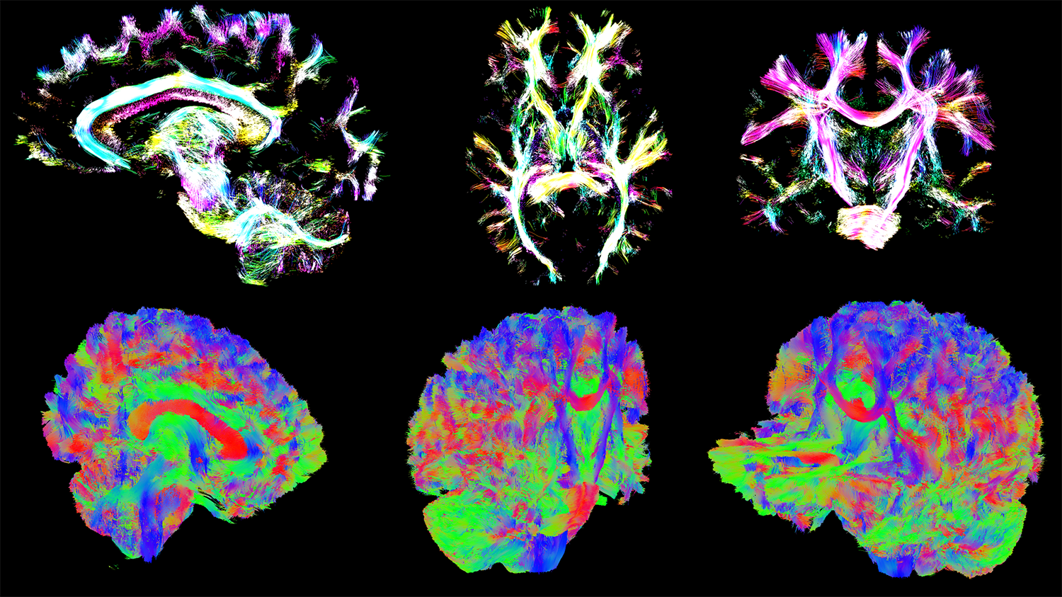
Top: Track Density Imaging (TDI)[4] rendering of whole brain tractogram using alpha blending.
Bottom: Whole-brain slicing shown along different cutting planes, discarding streamlines located in front of the clipping plane, keeping the rest in-context.
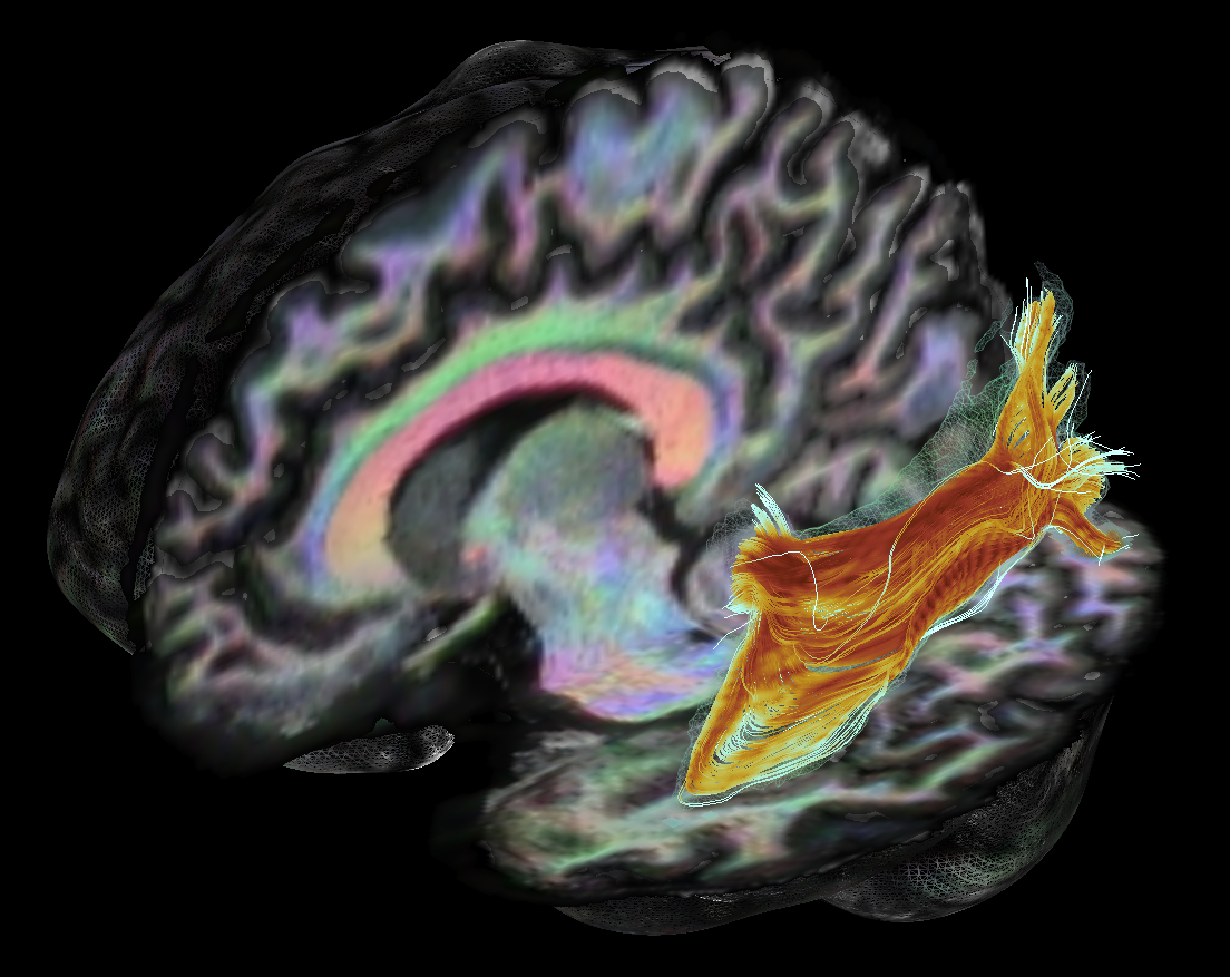
Left meyer's loop (ML) reconstruction using MAGNET[6] with seed-ROI located anterolaterally to the LGN, and inclusion plane in the occipital pole.
Coloring: FA values along streamlines (from blue to orange). Outer-shell: Subject-average across 5 scans. Background: Anatomical T1 image with fODF-derived RGB overlay.

Top: Conventional orientation-based coloring gives no information on the selected peak amplitudes at the location where the two bundles cross.
Bottom: Peak amplitude coloring indicates a higher amplitude along the blue bundle and a lower amplitude for the green one. Note that any scalar value can be encoded within the norm of each peak.