2894
Towards Unified Colormaps for Quantitative MRF Data1Case Western Reserve University, 44106, OH, United States
Synopsis
The goal of quantitative methods such as MRF is to provide a quantitative characterization of tissue physiology and pathology. These data are displayed as images to convey both geographic/anatomical information and quantitative physical property measurements. But this also means that the manner in which the information is displayed is critical. Here we propose several color map alternatives that have been optimized for use in MRF. It is hoped that the use and further optimization of these maps by the community will further improve our ability to visualize and understand this kind of quantitative data.
Introduction
The goal of quantitative methods such as MRF is to provide a quantitative characterization of tissue physiology and pathology. These data are displayed as images to convey both geographic/anatomical information and quantitative physical property measurements. But this also means that the manner in which the information is displayed is critical. Color can be incredibly useful in visualizing this kind of data. Humans can perceive differences in color where differences in brightness are difficult to distinguish. Color can also help sort information into well-defined groups better than a simple grayscale representation. This is particularly useful in MRF where multiple tissue properties are imaged simultaneously. Having a clear way to intuitively separate out different maps from one another visually (e.g. T1 vs T2 maps) makes the interpretation of the data significantly easier.
Unfortunately, there are an infinite number of possibilities for displaying this information in color and some of these choices are actually harmful to our task in medical imaging. Extra edges can be added to the display, or alternatively edges can be diminished, either of which can lead to misdiagnosis. There should also be a consistent ability to distinguish differences in the underlying values across the entire range of the colormaps. Poor choices can lead to perceptual problems as well, especially for people with color blindness. High or low values shouldn’t be linked to an individual hue alone, since there is no intrinsic ordering between different colors. For example, there is no intuitive reason why a red color would indicate a higher T1 value as compared to a blue value. Ideally a colormap should always provide a clear perceptual understanding across the entire range of the data. MRF has the additional constraint that the data often have a large dynamic range (as in T2 maps) and require dedicated maps in order to display all of the information throughout the range with equal visual weighting.
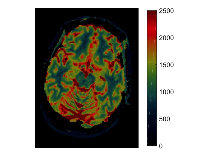
Rainbow or jet colormaps are the worst and are actually harmful. It is not just our opinion1.
Researchers in quantitative MRI and MRF should stop using them. These colormaps introduce artificial edges in some parts of the range, completely hide edges in other parts of the range and lack any kind of intuitive perceptual ordering. See Figure 1.
Methods
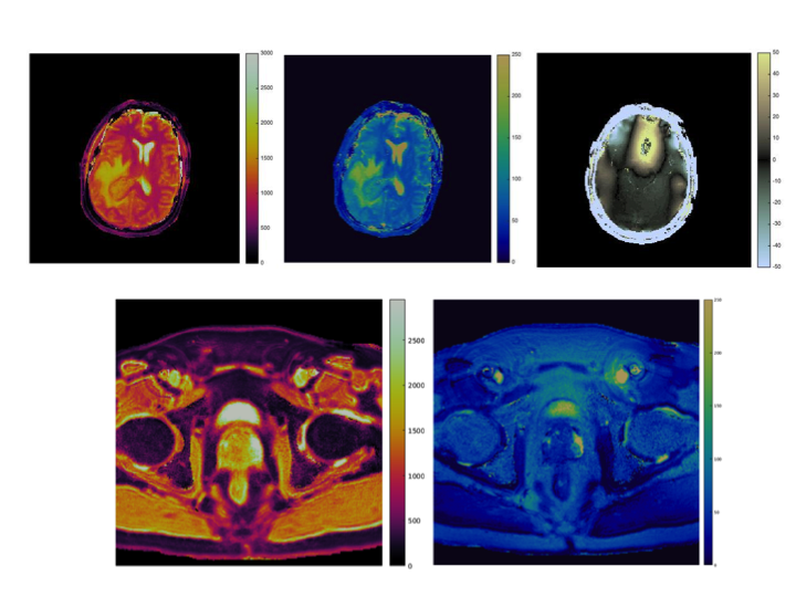
In order to address these needs in MRF, we propose three new colormaps for T1, T2 and off-resonance based on the field of perceptual colormaps that are designed to meet the needs of MRF. These are all based on the CIE LAB colorspace and the equations and code to derive these maps will be provided. Each of these maps is specific to the target tissue property and each can be visually identified without any significant training. They are also designed to be used across multiple body parts with a consistent display range, such that one can start to link a given color to a specific T1 or T2 value without needing to rewindow or change the display when switching between different organ systems. In this case, the T1 is reddish while the T2 map is in the blue range. Each colorscheme is designed to avoid false or missing edges all include both luminance and hue changes throughout the range in order to provide a large perceptual difference between neighboring values. Both the T1 and T2 colormaps include an exponential weighting in order to display the wide dynamic range in an easy to interpret format while maintaining an approximately uniform sensitivity to small differences throughout the colormap range. Finally, these maps are being optimized such that people with colorblindness can also work with these data.Conclusion
Especially in MRF and other quantitative MRI methods, we need to be careful when using color to display quantitative maps. In particular, our field needs to stop using rainbow or jet colormaps. Here we have proposed alternatives that have been optimized for use in MRF. It is hoped that the use and further optimization of these maps by the community will further improve our ability to visualize and understand this kind of quantitative data.Acknowledgements
This work was supported by Siemens Healthcare.References
1) Borland D1, Taylor MR 2nd. Rainbow color map (still) considered harmful. IEEE Comput Graph Appl. 2007 Mar-Apr;27(2):14-7.Figures